Logo Design
Overmotive
Welcome to my logo design portfolio—a showcase of strategic, clean, and purposeful branding. Each logo is crafted to reflect the brand’s identity with clarity and creativity.
Website Design Showcase
Logo Design
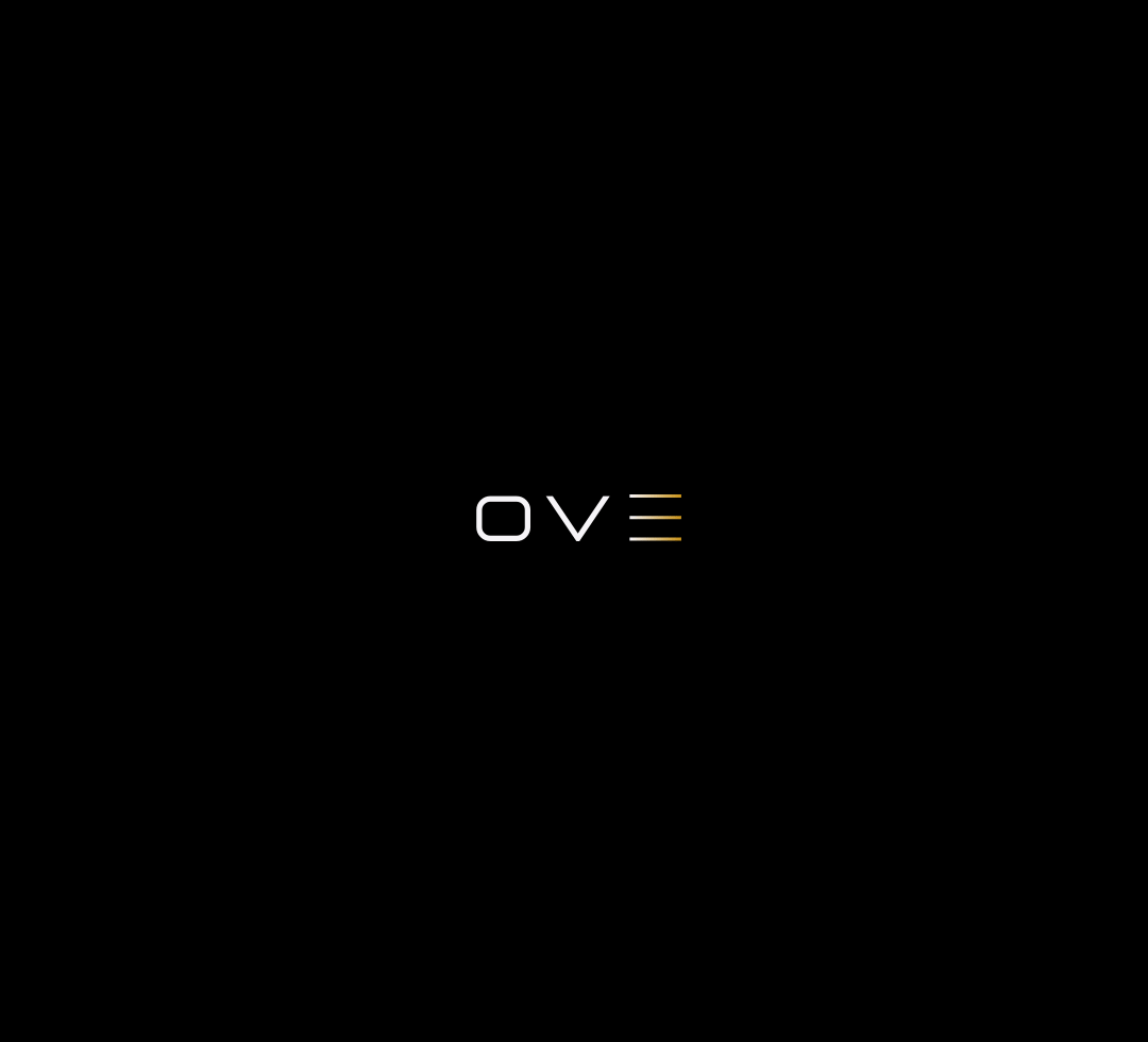
Mockup
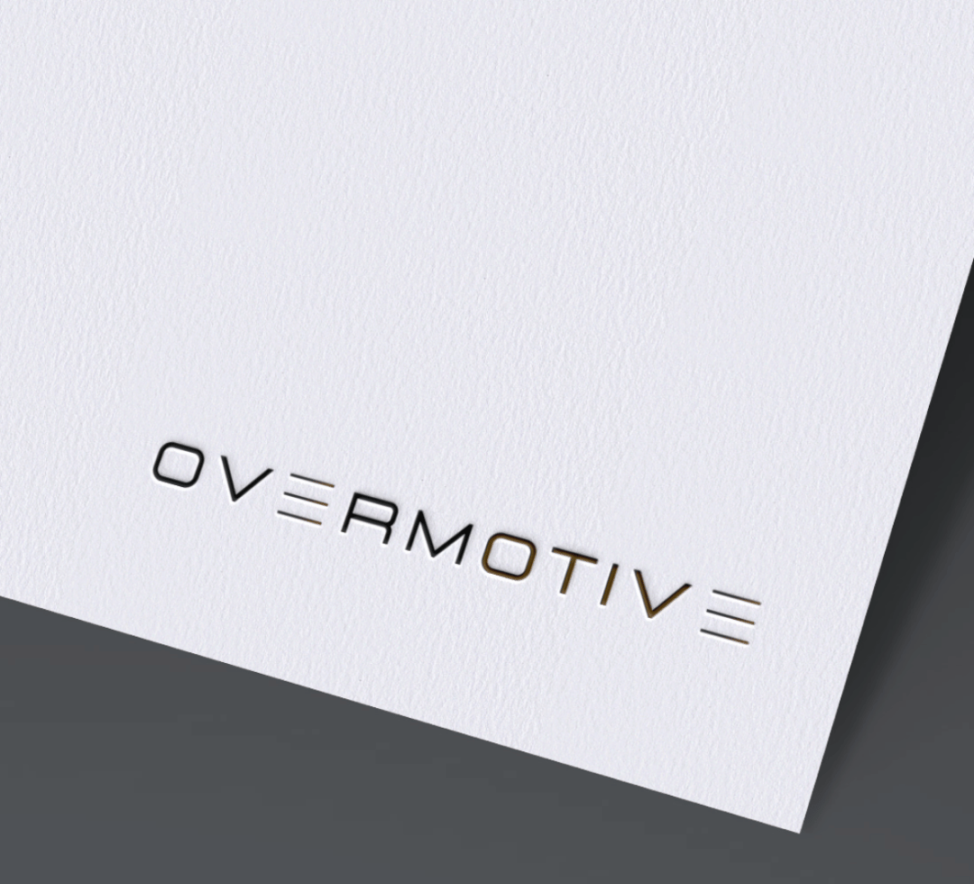
Mockup
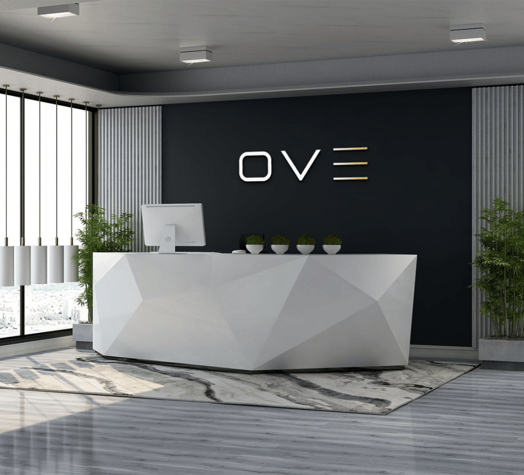
Mockup
The Challenge
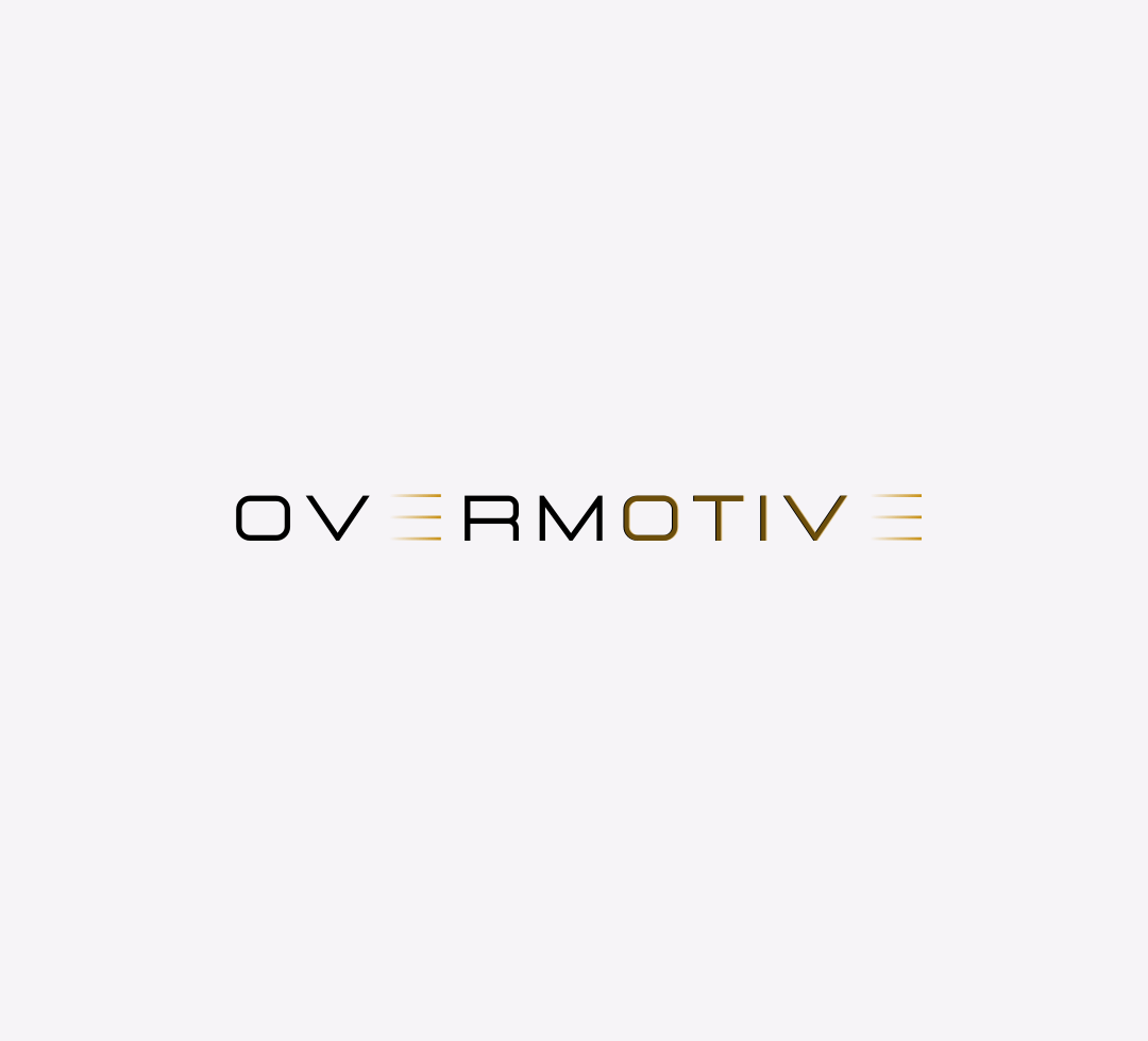
The OVERMOTIVE logo presents a modern and dynamic identity, using a sleek black-and-gold color split and stylized “E” characters to convey movement and innovation. Key challenges include maintaining legibility of the minimal “E” at small sizes, balancing visual weight between the two color segments, and ensuring font style consistency across the wordmark. Additionally, the design must remain effective across various applications—from digital to print and merchandise—while clearly aligning with the brand’s purpose and audience. These factors are crucial to ensure the logo is both versatile and instantly recognizable.
Our Solution
To improve legibility, especially for the stylized “E,” a slightly thicker line weight or subtle spacing adjustments can help retain clarity at smaller sizes. Balancing the black-and-gold color split can be refined by adjusting tonal contrast or introducing a gradient blend to create smoother visual flow. Ensuring consistency in letterforms—either by unifying corner styles (sharp vs. rounded) or customizing the type further—will enhance coherence. For versatility, simplified one-color and icon-only versions of the logo should be developed for compact or monochrome use. Finally, anchoring the design to the brand’s core values (e.g., speed, innovation, luxury) ensures the visual identity remains aligned with its intended message across all mediums.